
SUL’AMO
For Sull’Amo, I developed a cohesive brand identity that captured the restaurant’s essence of refined, high-end dining. The project included designing a sophisticated logo and a suite of print materials, balancing elegance with a modern, approachable visual language to appeal to a wide audience.

Restaurant
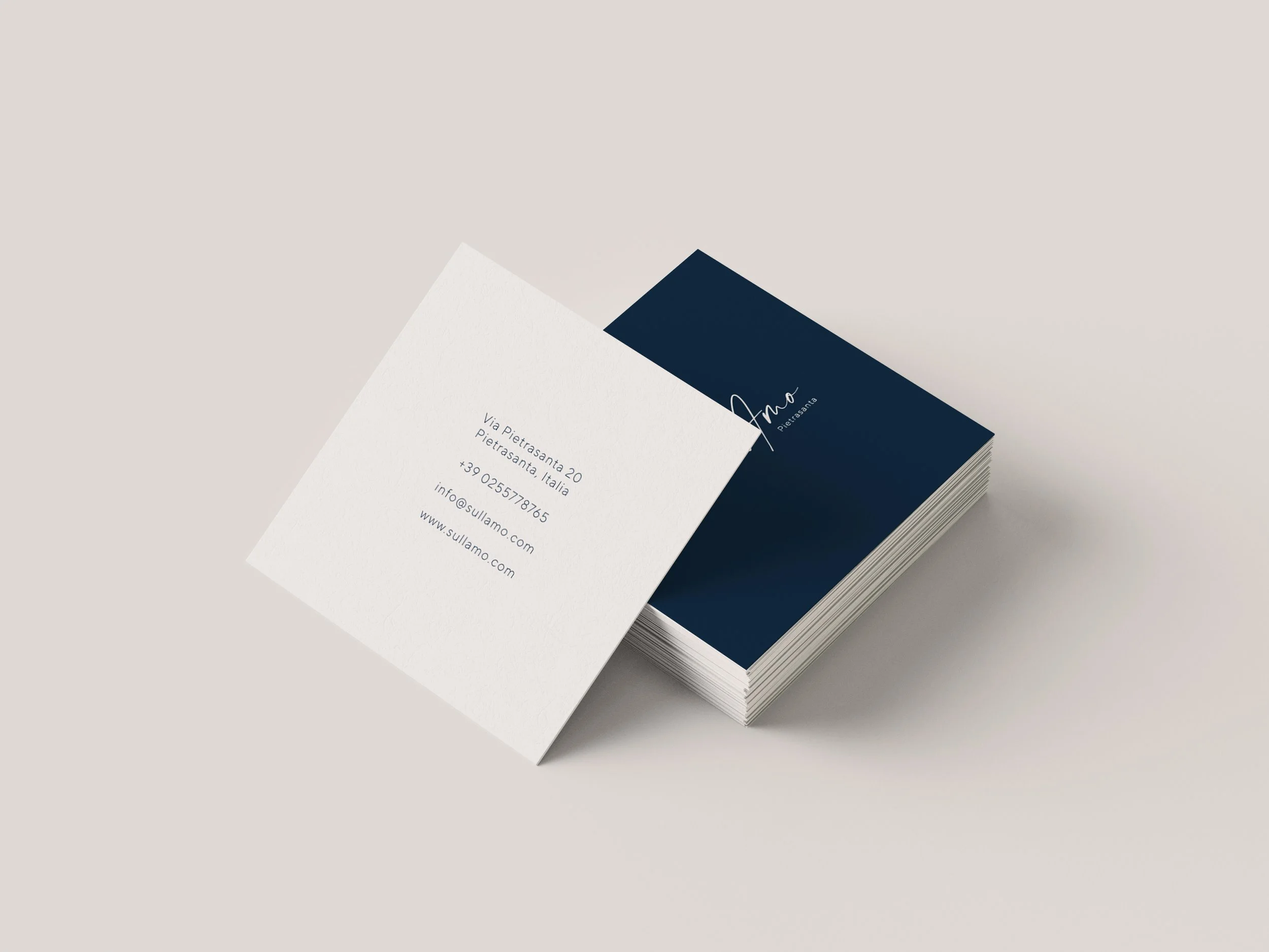
I led the entire branding process, from concept development to final execution. I created a logo that embodied the restaurant’s luxurious yet inviting atmosphere and designed print materials that reflected this aesthetic, ensuring consistency across all touchpoints, including menus, business cards, and promotional materials.
brand identity

The design process began with an in-depth exploration of the restaurant's values and target audience, followed by mood-boarding and initial sketches. I refined the logo and visual elements through multiple iterations, ensuring they conveyed sophistication and modernity, and then developed cohesive print materials for the final brand rollout.
BRAND COLOR SCHEME

The brand's color palette features elegant shades of navy blue paired with soft taupe and cream, evoking a sense of sophistication and balance. Navy provides a bold, modern edge, while the taupe and cream offer warmth and approachability, creating a timeless yet contemporary visual identity for the brand.

TYPEOGRAPHY
HV Clio adds a classical, traditional touch to the menu, accenting categories and titles, while TT Norms, a modern geometric grotesk font family, offers clean proportions and a neutral look. Activating stylistic alternates in TT Norms gives the typeface a more humanist feel, balancing modernity with tradition.


The main challenge was creating a visual identity that exuded luxury without feeling overly exclusive. By blending elegant design elements with a modern and accessible aesthetic, I crafted a brand that resonated with both high-end diners and those seeking a welcoming, refined dining experience, enhancing Sull’Amo’s market presence.
